
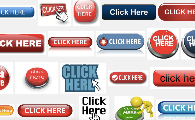
I love reading Ivan Levison’s newsletters. But I have to admit to a very visceral reaction when I see anyone advocating click here links or buttons (as he did in his December 2012 newsletter). I think they are a scourge of Internet usability because they require the user to read (and re-read) the text before the link to have any idea what the link leads to. Imagine if every link were done this way. You might get text like this:
To backup your files, click here. To view your files, click here. To delete your files, click here.
Compare the usability of that to this:
You can back up your files, view your files or delete your files.
The second option is better because:
- It is more compact.
- The links are more useful and much less ambiguous.
- The links will improve SEO because they include relevant text.
Now, I understand the “imperative magic” of “click here” (probably from reading one of Ivan’s newsletters and other research I’ve seen). But that doesn’t mean we can’t try a little harder and be a little more creative (and effective) with our imperatives. There are plenty of free HTML button maker sites and other inexpensive dedicated button maker programs out there.
The take-away message for today… The Internet would be a better place with more Buy Now!, Read Results and Delete Files and fewer Click Here links and buttons.
My two cents. 🙂